Ontario Has Been Getting Hotter
--Ontario Seasonal Temperature Changes Analysis for Historical Period (1951-2015)
Ziwang Deng, Xin Qiu, Xiaolan Zhou, Huaiping Zhu*
LAMPS,Department of Mathematics and Statistics,York University
*Project Leader: Professor Huaiping Zhu
2017-08-08
Introduction
Inspired by a news article published on New York Times on July 28, 2017 [1] based on work carried out by Dr. James Hassen on global and hemispheric analyses[2], the York University LAMPS group did similar analyses for Ontario. The following animations clearly show that Ontario has been getting hotter – extreme hot events occurred more and more frequently in recent decades; and this is more apparent in the annual (Fig. 1) and winter (Fig.2) average temperature plots.
Methodology
Plotted in the following animations are frequencies of occurrence (y-axis) of Ontario local seasonal and annual temperature anomalies (dT) (at 608 CRU TS3.24.01[3] grid points within Ontario) divided by local standard deviation (δ, x-axis) obtained by binning all local results and 11-year period into 0.05 frequency intervals. Area under each curve is unity. Standard deviations are for the 1951-1980 period[1][2]. The vertical dashed lines are used to separate the events classified as
- Extreme Cold:dT<-3δ
- Cold:-3δ<=dT<-0.43δ
- Normal:-0.43δ<=dT<0.43δ
- Hot:0.43δ<=dT<3δ
- Extreme Hot:dT>3δ
Results
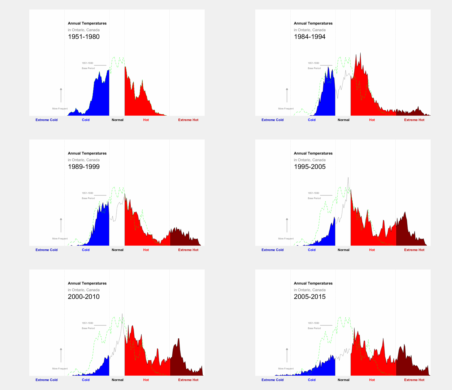
Figure 1 Frequency of occurence of local annual temperature anomalies
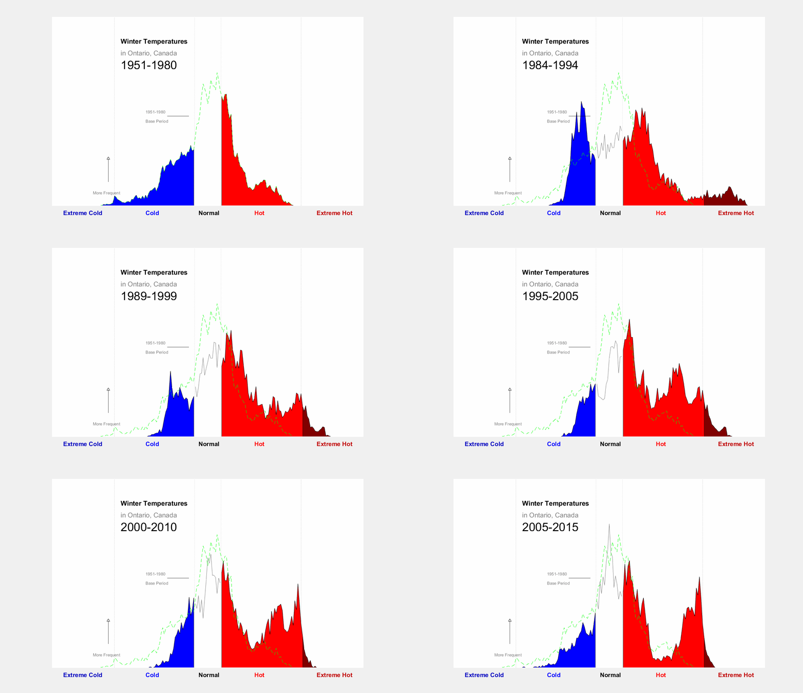
Fiure 2 Same as Figure 1 but for winter temperature
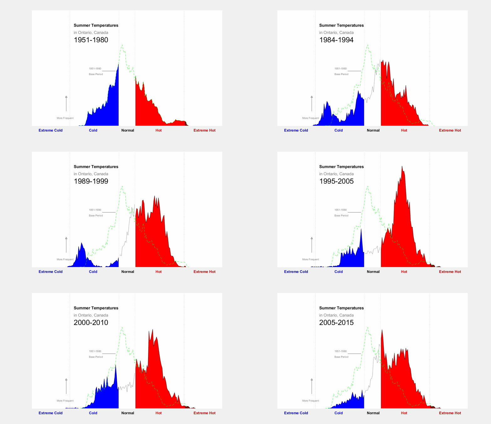
Figure 3 Same as figure 1 but for summer temperature
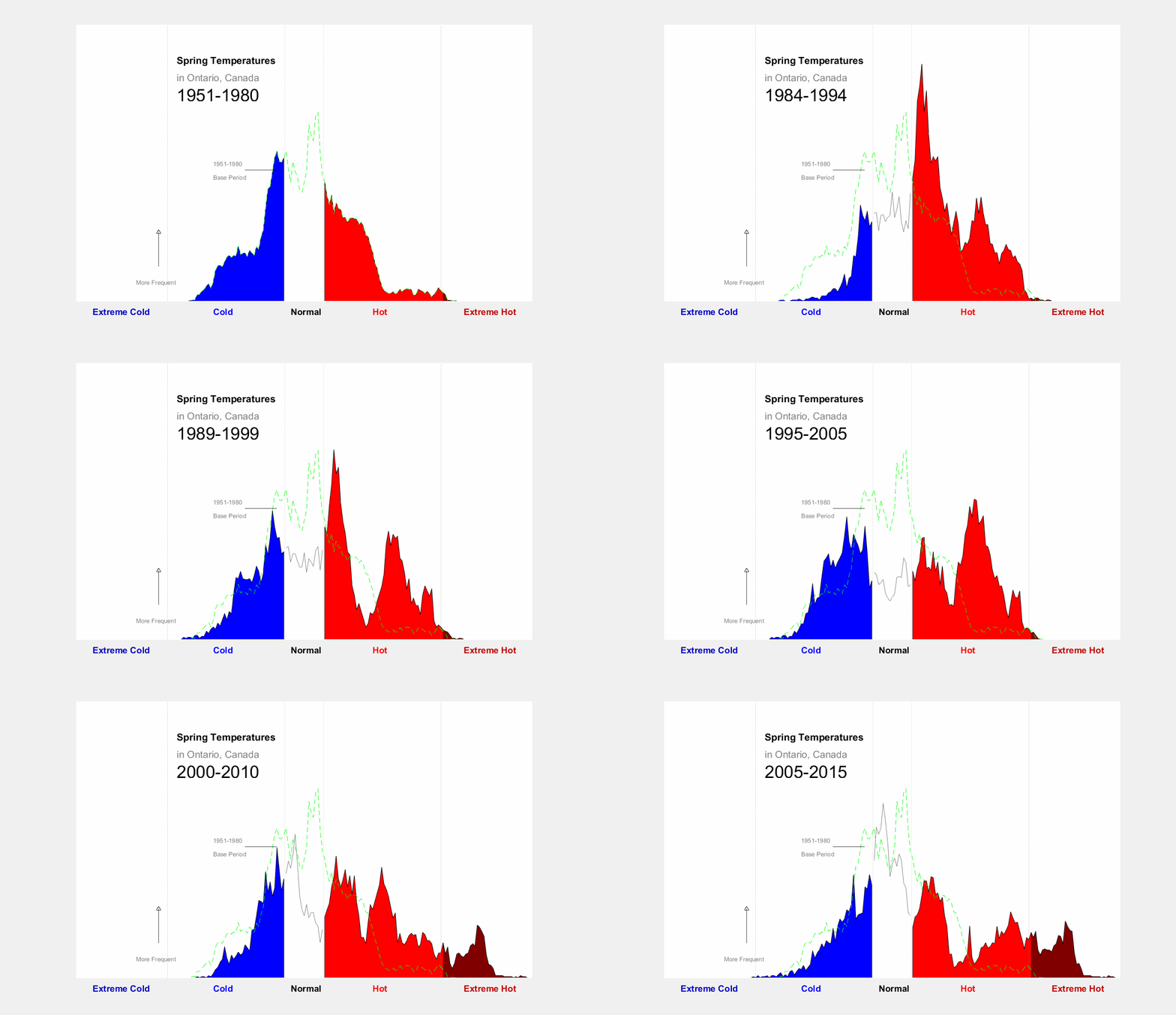
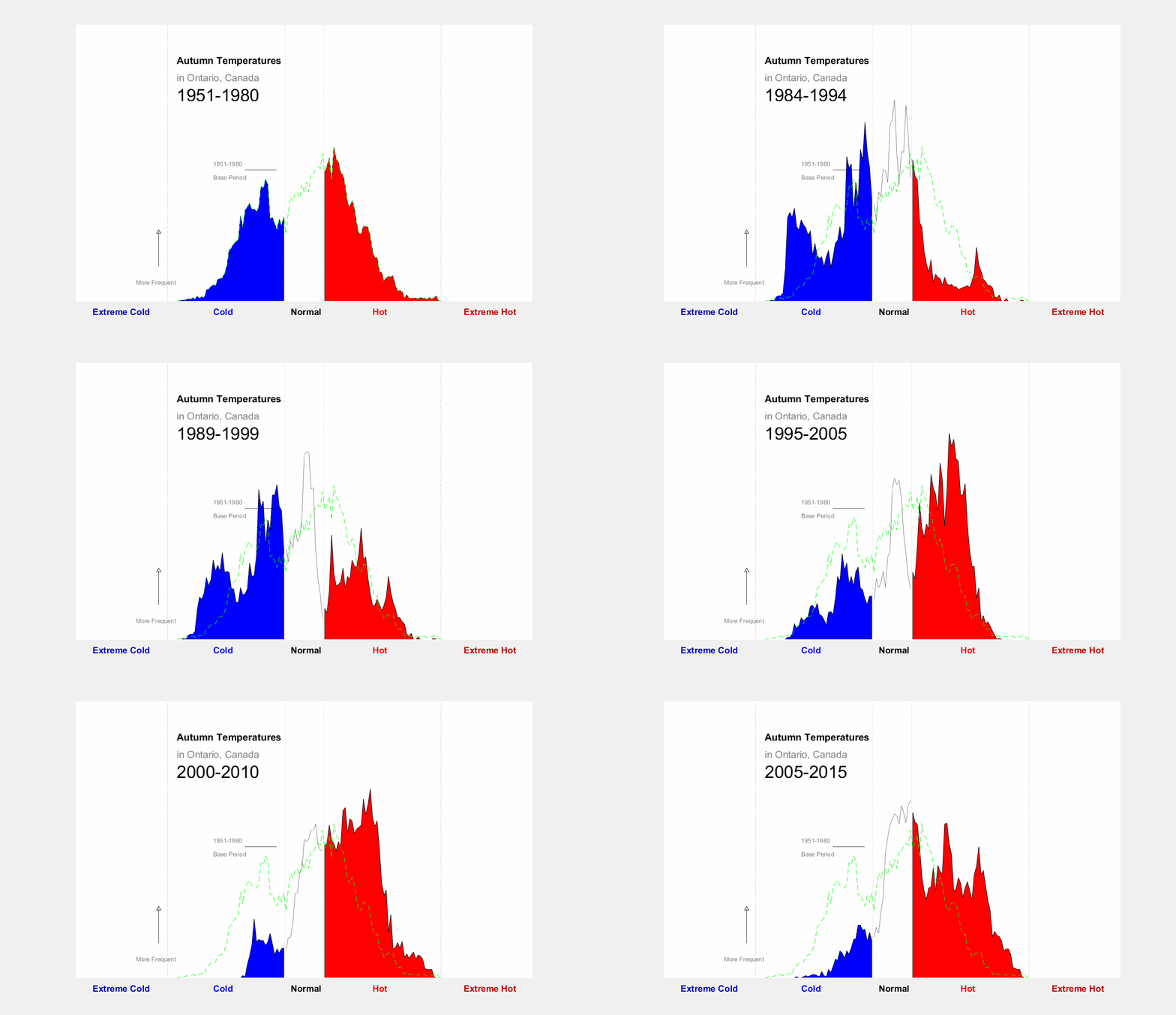
Figure 4 Same as figure 1 but for spring temperature
